Introduction
Fall 2017 | Duration: 2 months
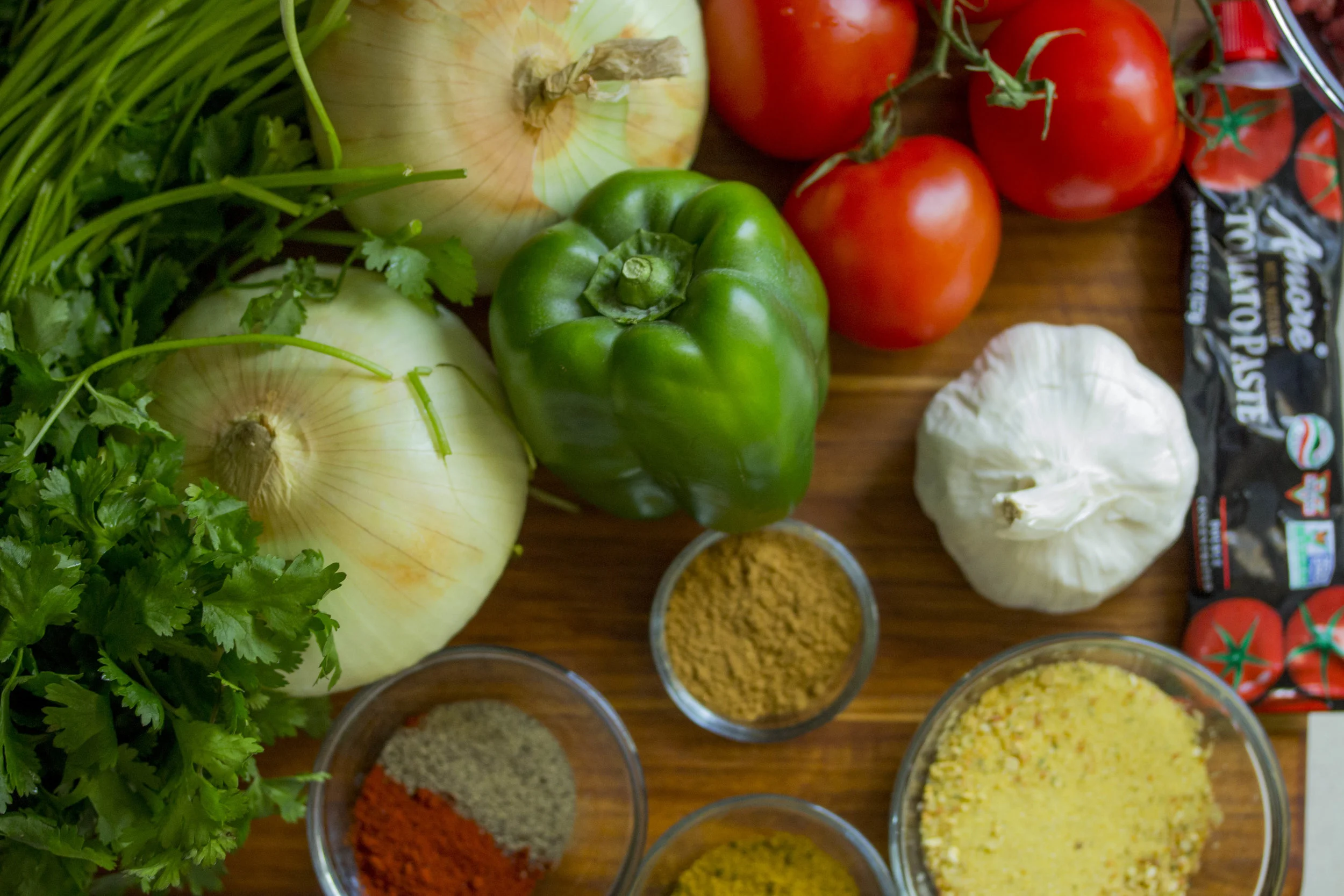
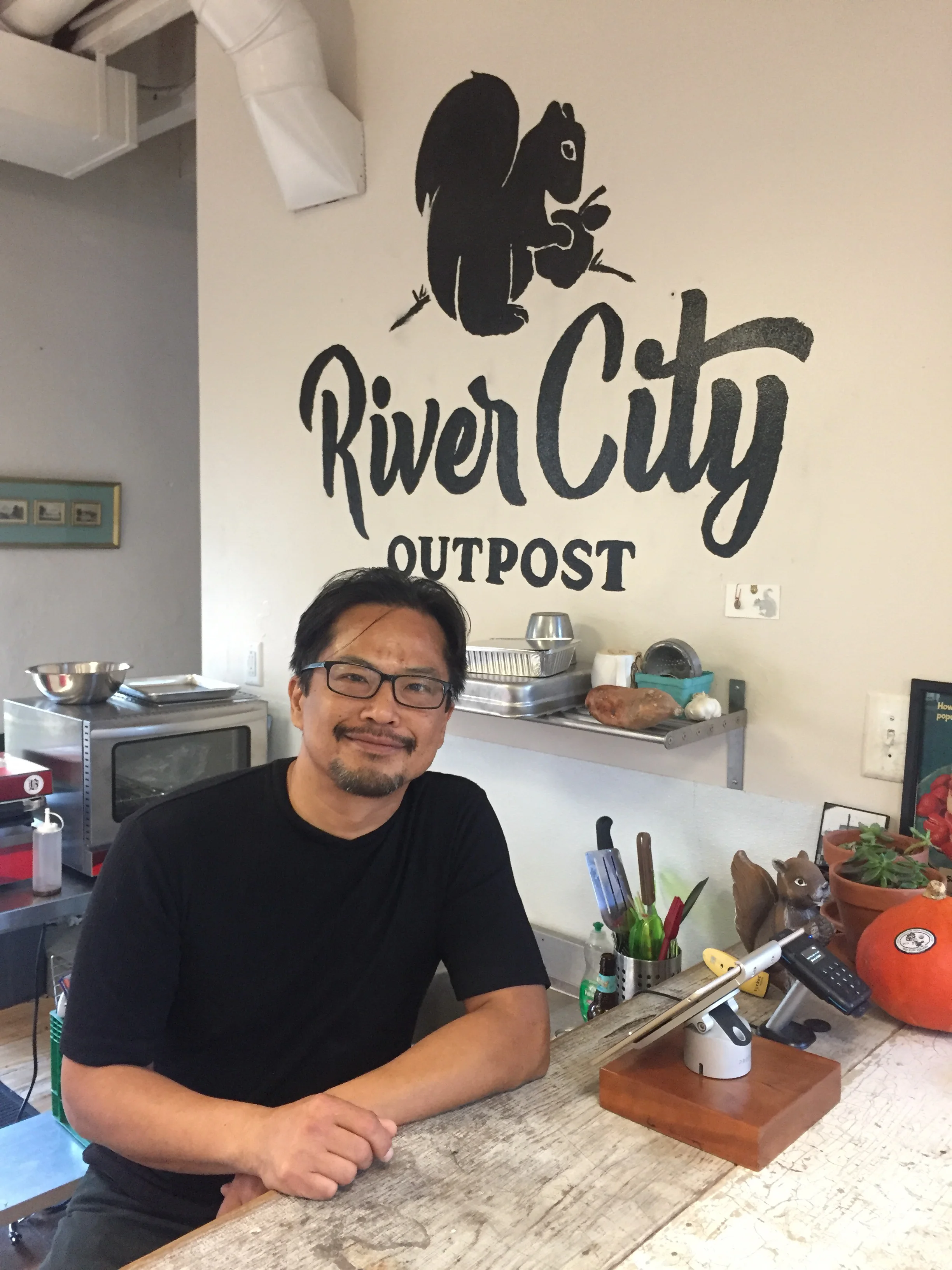
My group partnered up with a local grocer: River City Outpost. They provide a CSA (community supported agriculture) service called "The Snack Sack." It is a subscription service where customer's pick up a sack of food weekly that contains locally grown produce. This app was designed to organize the contents of The Snack Sack while adding a community aspect. Challenge: The group was challenged with clients who were less then eager with the idea of us speaking directly to their customers. We had to be clever in our approach.
Key Takeaways:
Goals - Teach, clarify, connect
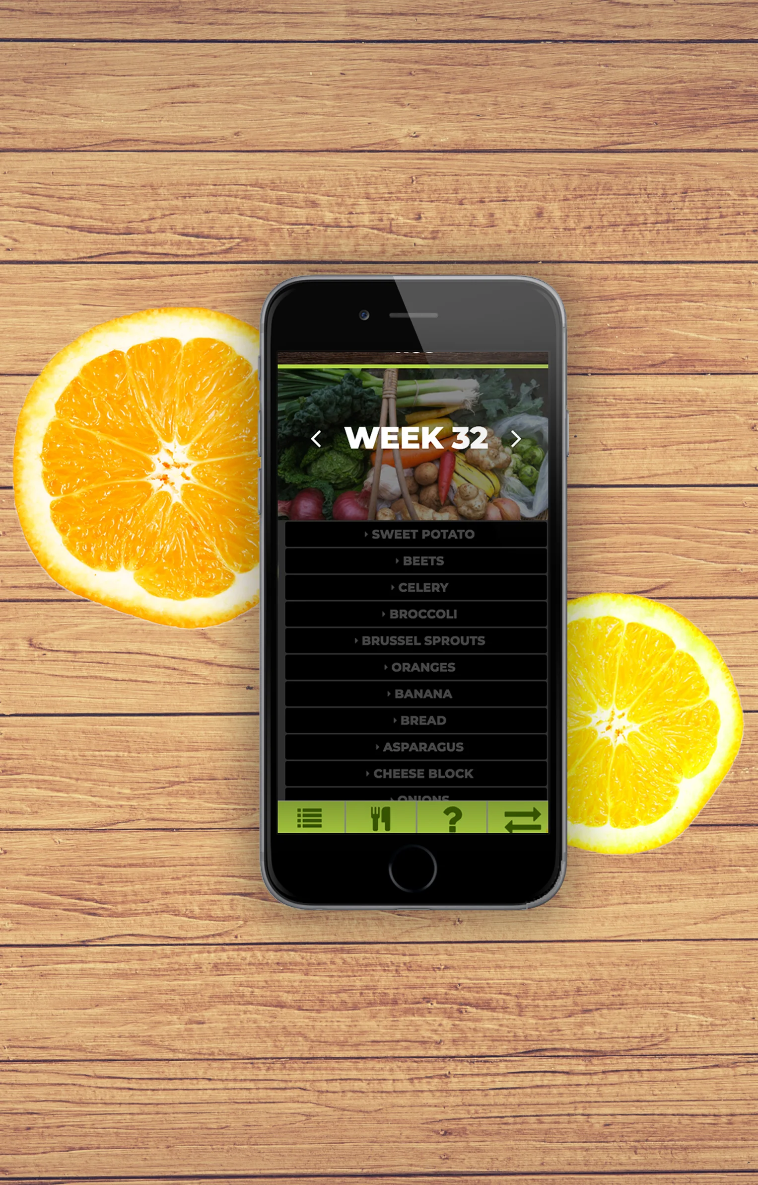
Designed a drop down list to teach about each week's produce
Provided recipes with listed ingredients not featured in the sack
Allow user's to connect through a community forum
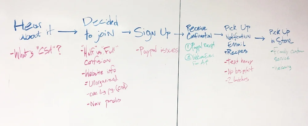
PROJECT NAVIGATION
We had to truly understand the will of the client to succeed in this project. He is very passionate about the community aspect of his store. It was very moving to see him get excited when he told us a story of how his customers brought in their children to meet him. He also loves to hear about how the customer's have learned about new foods because of the sack. We knew it was important not too take away from the face-to-face interactions customer's had with our client. However, from using the service ourselves, my group found gaps in clarity with produce details and recipes. This app was carefully designed to allow customers to interact with each other via app but keep the pick-up in person.
My Role: This project first showcases my research abilities (interviews and experience maps) then gives an overview of user personas which were critical in this project. From there my ideation shows how I refocus myself towards the goals to then refine the work. The last part demonstrates my strong coding skills with a demo of the app.
Research
Research
Client interviews, end-user research, walk-a-mile immersion, experience mapping.
Client InTerviews
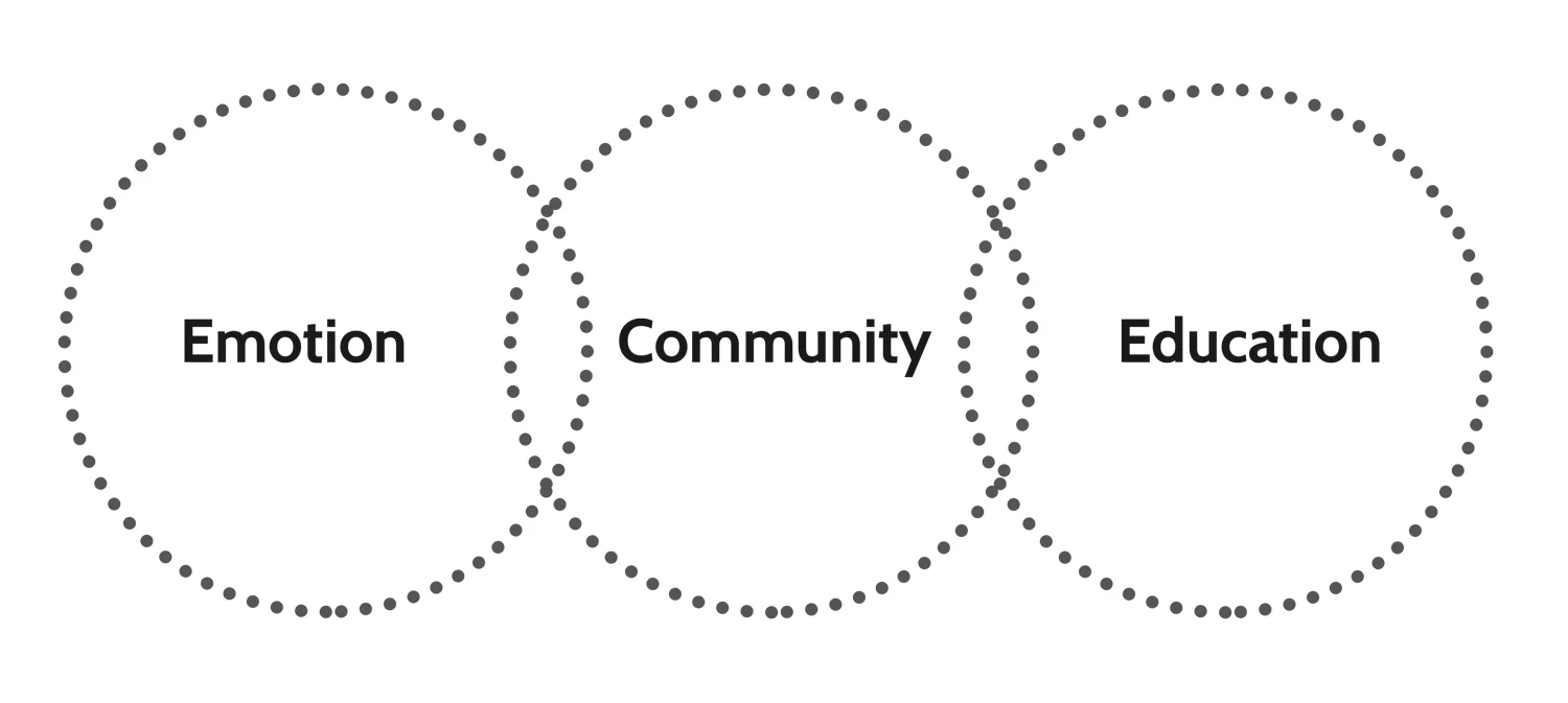
Our client interviews made it clear that the primary concerns of our clients are the emotion of the business, building community, and educating. The business goals were actually much lower on the list compared to their ideas of bringing people together around food.
end user outreach
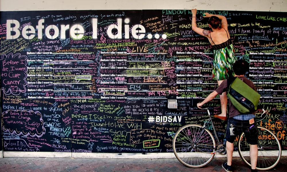
Our client was unique by not allowing us to speak directly to the customers. We took a "Before I Die" approach to connect with them.
Think quick! This part of the design process worked our minds. We had to quickly identify a way to get answers to our questions. We wanted to know what aspects of The Snack Sack was most important to our end-users.
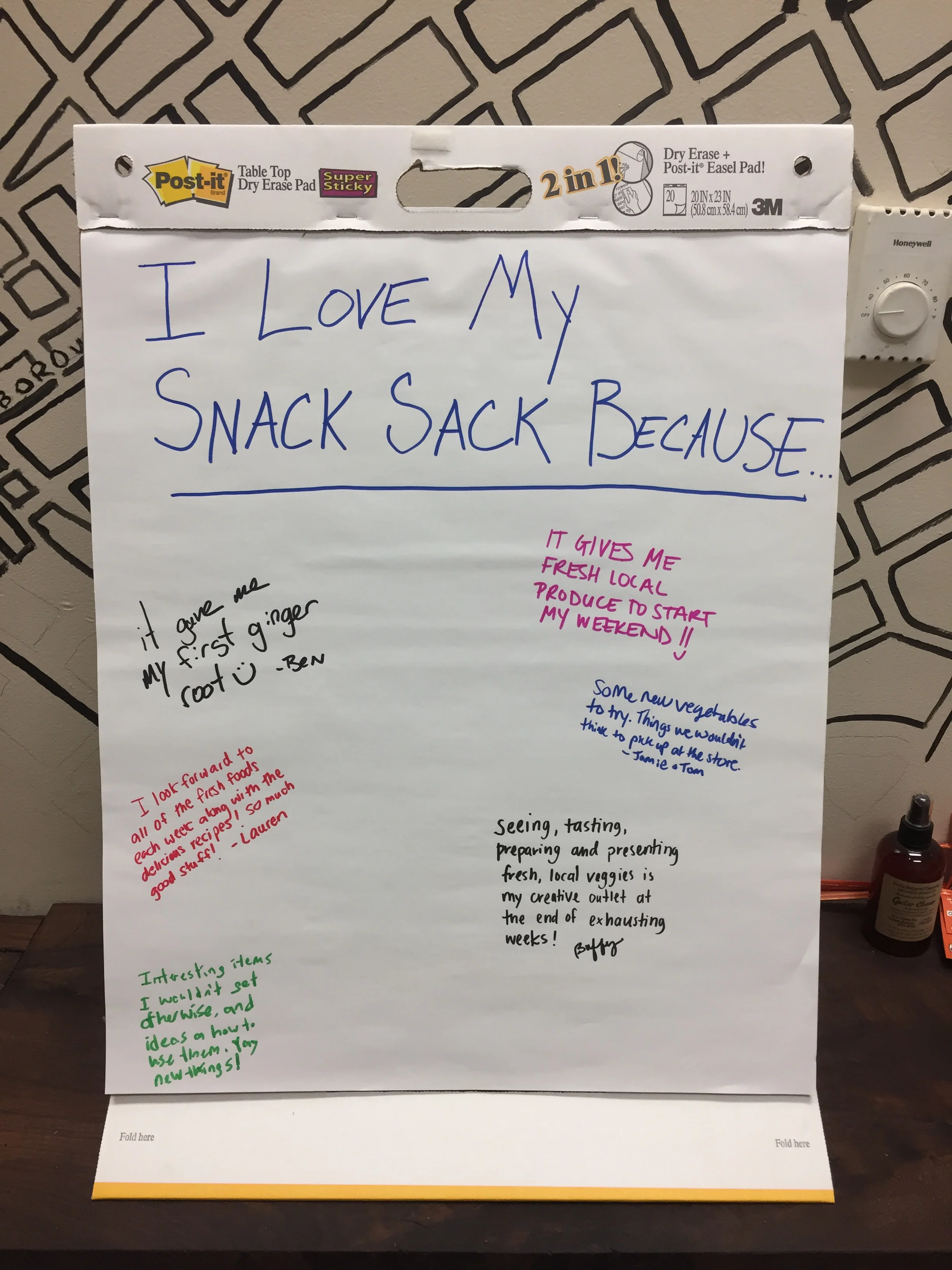
I love my snack sack because:
"Some new vegetables to try..."
"Interesting items I would not have otherwise tried..."
Take Aways:
This provided insight to create our personas later on
This went on to shape our goals and project focus
walk-a-mile
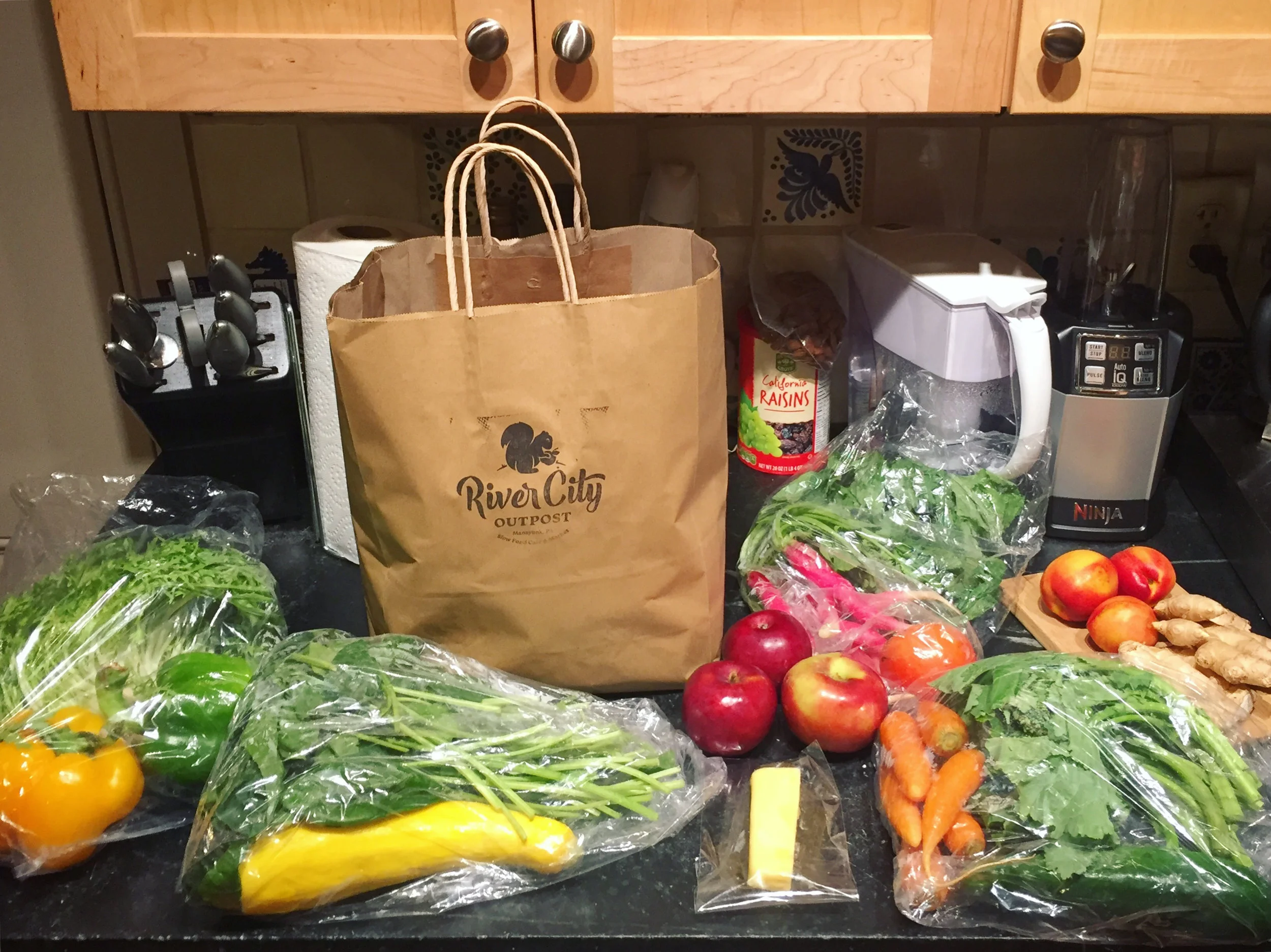
Upon purchasing a 4 week subscription to the Snack Sack, each week a team member got to experience first-hand the pros/cons. We gathered weekly to document and analyze the findings.
Take Aways:
Needs to provide recipes, advice on how to prepare produce, and limit food waste
Development
Development
Experience maps, User personas, Features brainstorm, The hook framework, Goal defining
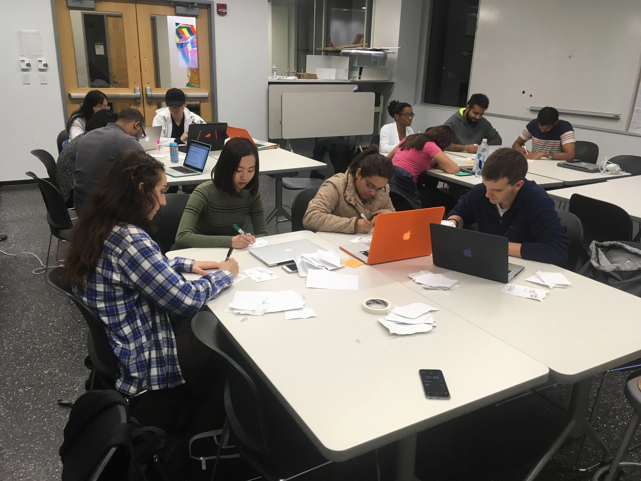
My group working on "The Hook" framework. (I am on the far left)
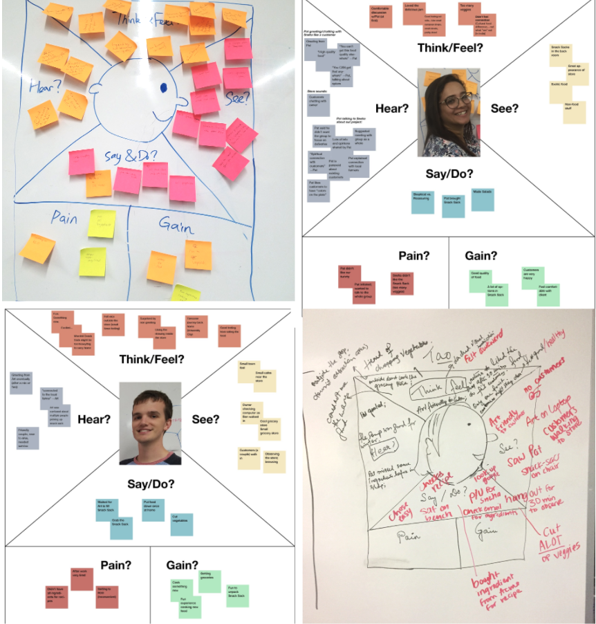
Experience mapping
After the Walk-a-Mile we drew up experience maps to show each person's pains/gains. We documented the whole process of picking up the sack at the store up until the food is made. Many of us felt anxious that prior to pickup there were ingredients that were needed additionally to make the recipes that the store emailed. Our main concerns are listed below.
Take Aways:
Recipes should be given prior to pickup and explicitly state which ingredients are additionally needed.
There should be advice on how to prepare produce and a way to limit food waste.
User flow
I created a user flow chart for my group to use to organize the steps from the very beginning stages.
(Please click the image to the left to enlarge it)
User personas
Shawn who is a representation of our client values the emotional value of his business and wants to make a positive impact on the community. His goals are to further build this sense of community.
Alice, a representation of the end user, loves to learn about new foods and wants to support a local business while managing her environmental impact.
Take Aways:
These personas influence the design through-out the rest of the project by inspiring goals.
freatures brainstorm
The group took to the white board to brainstorm every possible feature our personas would want. We then connected the and color coded them based larger categories. The larger categories are listed below.
Red: Recipes
Blue: Community based features.
Green: Learning
The hook framework
We did an exercise to get us thinking about ways to keep the user coming back to the app. After this we figured out the solution easy. Our app would be used to notify the customer that the sack is ready for pickup.
Goal defining
1. To provide detailed information about the food in the snack sack
2. Have recipes that make note of which ingredients were not included in the sack
3. To allow community interaction
4. To reduce food waste
story boarding
I created an illustration to show when the client and end user would be using this app. This helped me keep the story clear. The client might use it to update recipes, take a photo of this week's sack, and notify the end-user.
The end user might use the app to learn about foods in the sack, chat with the other members, ask questions, while cooking, or while grocery shopping.
Ideation
Ideation
This is where the group diverged and created their own unique solutions.
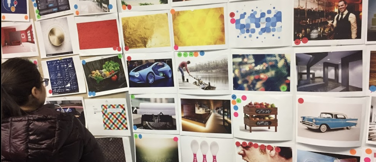
I started with a mood board activity to ideate stylistic decisions
Style guide
From the mood board I extracted colors based on the theme sustainable modern which is a blend of both personas. I pulled inspiration and determined fonts. This was a very fun part of the process.
Take Aways:
This style guide will later help make prototyping easier.
wireframes
This was a very broad exercise to get thoughts out on paper. I was playing with the idea of people able to see other users in the neighborhood or having recipes filter based on categories. These ideas were too far out of the focus for this project and would later be eliminated.
Take Aways:
I liked the idea of having card style recipes. This idea carried out through the whole project. From this point I knew generally what pages were needed.
sitemap
I wanted very little focus to be on the profile. The user should be able to get the information quickly and easily. This was the first sitemap which I later refined to better reflect the goals I established earlier. I wasn't aware until user testing that this wasn't the best.
Take Aways:
Too much focus was put on community interaction. The ultimate focus should be on the contents of the sack.
low to medium fidelity wireframes
I used Axure to design medium fidelity wireframes because I needed to see more details to determine how successful this idea would be. I loved the lower navigation because it is a easy reach for the thumb while holding a phone.
Refinement
Refinement
After user testing I knew I needed to narrow my design to solve key problems.
high fidelity prototype
I wanted to test two types of navigation. The wireframes show a one page scroll navigation using drop downs based on each week of the sack. To get to additional items you must scroll past the list of produce in that sack.
user testing
I used Axure to create a working prototype. One user misinterpreted the phrase I used to describe an area of the app designed to cut down on food waste. Another user pointed out that my app was too text heavy and needed more imagery. The majority of users preferred the bottom navigation to the one page scroll.
Take Aways:
I found that my user's were distracted by the range of options.
goal oriented problem/solution map
At this point in the project I knew my personas like I know a good friend. From testing and refining I knew I needed to refocus the project around key problems. I designed this map to keep me on track.
final design
I combined the two ideas I tested and have both a scroll page per week but also a bottom navigation. Between each week the bottom nav will have unique information. From left to right the navigation is: list of produce, recipes, question forum, and food swap. Upon clicking the name of each produce more information will drop down to teach the user about it.
The recipes link to outside websites and explicitly shows what additional ingredients are needed. The question forum is designed for community members to ask how to use the produce and get to know each other. The food swap shows what items were left at the store by other members of The Snack Sack because they won't use an item for various reasons like allergies or diet.
The demo in the next section was coded in HTML/CSS using Bootstrap for layout, SASS for styling, and JQuery for features like the dropdown and the cards in the recipe section.
Take Aways:
The most challenging part of this project was learning to work with the client to get the research needed. The most fun part was coding and styling!
Project Take-Aways
I learned a lot about client-designer relationships. They can make or break a project so in order to not "break" you must brainstorm quickly to create solutions to the challenges.
I practiced my code. The demo is fully coded and uploaded to Bitballoon. I used Bootstrap for most of the layout. I used JQuery to create the drop-down lists and I used LOTS of HTML5 and CSS.
I love coding and this really helped me learn all about layouts which helped me advance my graphic design skills. I taught myself graphic design years ago so this really hammered in the concept of rows and columns which improved my organizational graphics skills.
Up Next...
LANGUAGE LEARNING
What if there was a toy that taught children how to verbally communicate in a second language? We designed a holographic character that does.
UI/UX Design, Research, Prototyping, User Testing, Visual Design