
Introduction
Goal: To achieve a better e-commerce experience than the original design.
My Role: I was fully responsible for this design. It was a self-guided project.
existing design
To achieve a better e-commerce experience for the consumer this redesign does three things. It evokes emotion, emphasizes call-to-action, and keeps the consumer buying from Nike. The updated visual design achieves the first two and the updated user flow achieves the third. I used consumer research to make a majority of my decisions and new 2021 UI trends for the others. I have walked you through my design process in this document. You can skip to the summary of the project if it better suits you by clicking here.
Step 1
To explain to you how I created this redesign for Nike I will walk through my design process. I first assessed the current design based on project requirements, consumer behavior research, current user flow, and inspiration images. (You can click the images to see them closer up in a lightbox.)
During consumer behavior research two quotes stuck out the most to me in a Harvard Business Review article. “This means that online shoppers are doing a lot of comparison, so online retailers should work harder to close sales quickly while they have the attention of the consumer.” and “When consumers purchase online, they tend to buy more.” This meant my goal for the project was to get the consumers from the product to the cart quickly and obviously. The second goal was to keep them buying from Nike by introducing the “Products for you” section.
step 2
Next, I dove into quick low fidelity wireframes to understand what layout would create the most simple flow and be striking in design. I also was trying to understand which mobile paired well but still stayed on target with my goals.
Step 3
The following step was to make UI decisions. I wanted to update the original design to be relevant in 2021. There were two things that drove my design. The first was the glassmorphism trend and the second was using the Pantone color of the year. Yellow was one of the 2021 colors of the year which I chose to bring into this design. The other colors were split complementary colors based on that yellow.
Step 4
I then experimented with creating a glassmorphism feel. I had to use transparency, background blur, a small border, and shadows to achieve the look.
Step 5
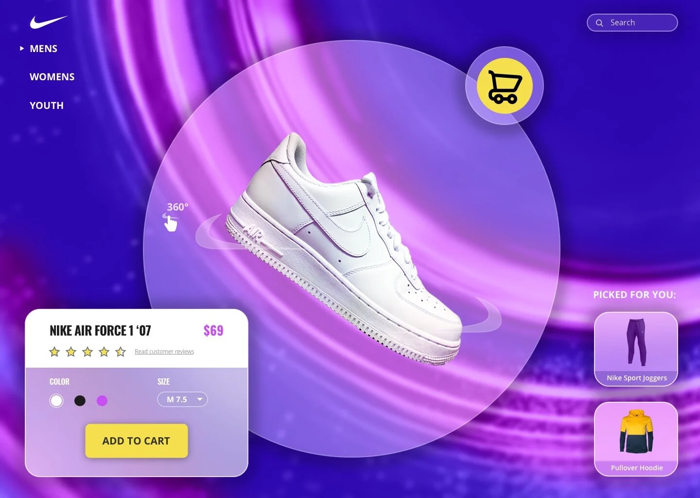
The last step in the design process was to create high-fidelity wireframes. The focus was on the consumer’s experience with the shoe. The consumer can rotate the shoe 360 degrees, read customer reviews on the shoe (research showed that the consumer’s main reason for buying footwear was performance-based), and stay focused on the task of buying the shoe. I made sure the call-to-action was contrasted with everything else on the page to encourage the consumer to click it. The cart button is also very prominent to draw the consumer’s eye and have them complete their purchase. The secondary features on this page are for navigating to other products on the Nike site encouraging more sales. “Spend is dramatically higher at brand stores and websites than in multibrand stores.“ This quote drove my decision to remove the top bar from the original design that leads consumers to NikePlus, Jordan, Hurley, and Converse.
Project Take-Aways
In summary, this design compared to the original evokes more emotion. Emotion is the number one driver in consumer decisions. It is likely that the consumer feels excited by the bold UI of this page but that would be something we would have to discover in user testing.
Up Next...
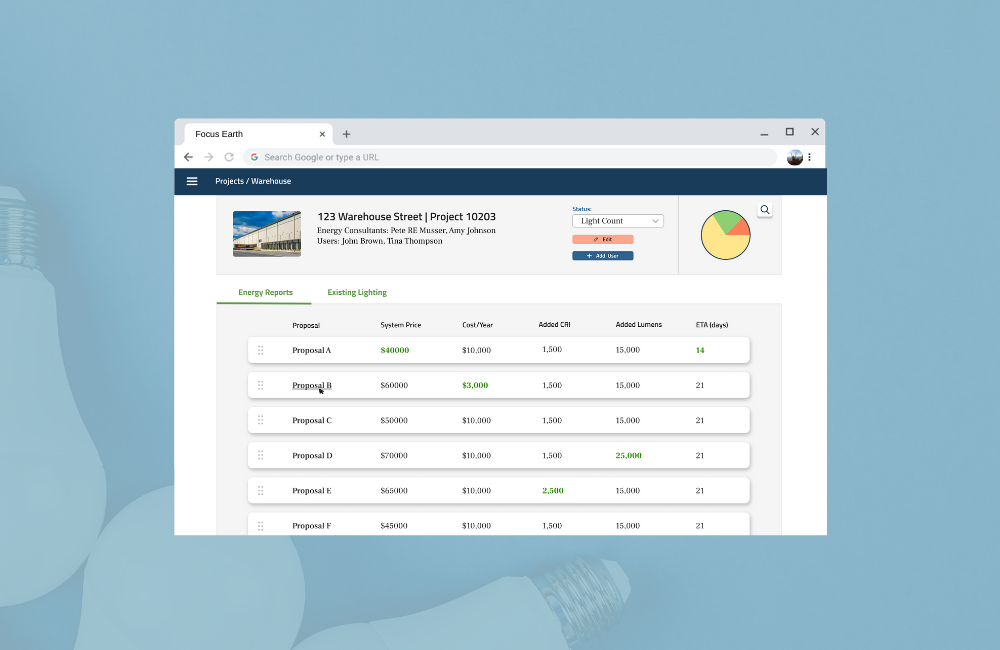
Focus earth - web portal
A LED lighting consultant needed to move from spreadsheets to manage data to a web portal. As lead designer, I conceptualized the design of the portal and created high-fidelity wireframes to send to the developers.
UI/UX Design, Visual Design