
Introduction
healthcare
At NTT Data I worked on a healthcare project that required data visualization. I was the only visual designer on this project and as such, I created mockups that would be used by the dev team. This project required the creation of color palettes, visual hierarchy, and visual rules for the charts and graphs.
Goal: To create mockups and prototypes ready for client presentation and development.
My Role: Visual designer
Data visualization
This project has over 5 different types of charts & graphs. One of the more challenging ones was the one with red & green showing negative and positive data. The client wanted to use blue instead of green but our team explained that for the correct amount of contrast we would need to use green. We also explained that the user’s interpretation of green and red would be perceived better since they are opposed by nature (think stop light).
What I learned: Taking ADA compliance into consideration is important, especially with graphs to make sure the user can read the graph clearly.
ui patterns
Establishing a color palette that could function well with the graphs and UI elements was very important to this project. This brand had bright colors which were fun to work with but challenging when deciding which shades needed to be used in certain areas. I established a categorical, sequential, and diverging color palette.
Figma & plugins
This project was completed using Figma and I used Stark to test for color contrast.
Project Take-Aways
I was challenged with design limitations because the client was using Tableau. This taught me to be creative within limitation.
Up Next...
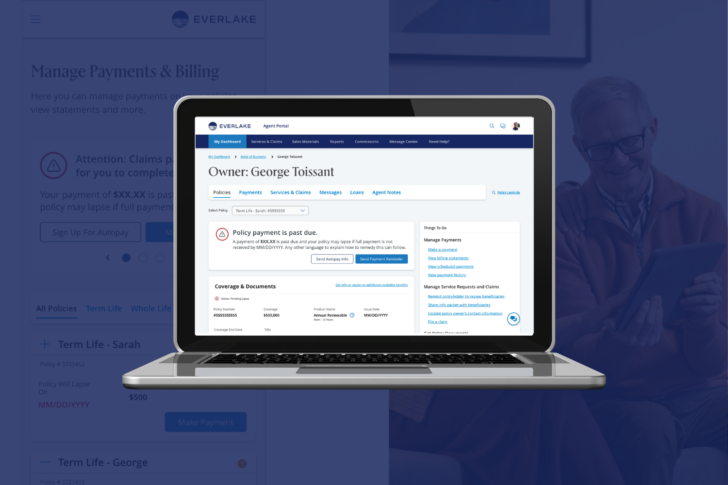
Everlake (health insurance)
Everlake is a life insurance company. They needed a customer and agent portal designed. This portal helps customers file claims, view existing claims, add beneficiaries, and more. The Agent portal helps agents manage customer accounts.
Visual Design