
Introduction

Spring 2018 | Duration: 3 weeks
Design Problem:
The client stated that people outside of the Miami area are not finding the site. The website needs to get more traffic from different cities to increase customers for those law offices. The client already has a SEO consultant but wanted a UX designer to propose a solution.
Current Website Evaluation:
- Over abundance of “calls to action” ex: Call now!
- Too much information
- Need for organized information architecture (Navigation)
- Each page has various phone numbers listed 5 times
Summary:
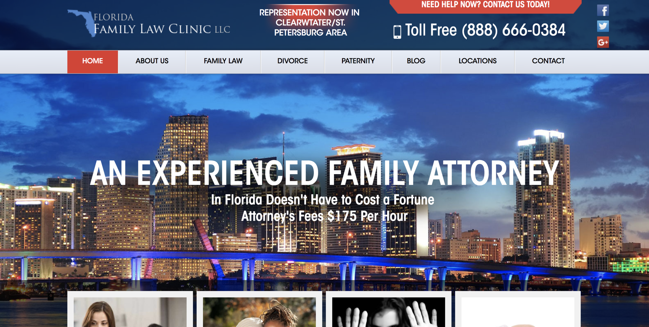
Much of the content on the homepage is repetitive. The homepage should be a brief overview of
the content the customer might find throughout the website with unique calls to action. It is all about flow. The homepage is the first impression. The company might be better suited with a more fitting main image like a generic law photo. The one currently shows a particular location which is something I would advice staying away from to increase customer engagement from other locations. It would also be fitting to change the tag line “An Experienced Family Attorney.” The customer expects the attorney to be experienced. A more fitting tag line may have something to do with the following line which speaks about pricing. For example “Afforable Florida Family Attorney.” There is a typo in the subtitle as well. There is a small slider in the header portion of the page. This should either become a large slider inside the page or be eliminated. Motion draws the eye but in this case it becomes quite distracting.
Research
Research
SEO Recommendations, Market Comparison
SEO Recommendations
Based on SEO forums around the web I have collected information on whether to have one large main website or have many little one to drive traffic from different locations.
Having One Central Website
"Advantages: Brand consistency can be maintained more easily, so the franchiser retains full control over what is published under their brand’s name. Combined strength. This is very important in the eyes of Google as the search giant moves its emphasis even more in the direction of brands and brand mentions. The websites for the better known companies will outrank the websites for smaller businesses (something which works in the favor of franchises). As a result, the more content you maintain under the one domain name, the stronger your website becomes.
Disadvantages: The franchiser is responsible for the digital marketing. This can be an issue without a strong, coherent strategy. It can also put off some potential franchisees if they perceive the online marketing efforts as being weak, and they’re unable to take the initiative due to the restrictions placed upon them by the franchise agreement."
Allowing Franchisees to Have Their Own Websites
"Advantages: This puts the emphasis firmly in the hands of the franchisee, allowing them to invest (as they see fit) in their own digital marketing, taking the concern away from the franchiser.
Having one website targeted solely to a specific geographic location could become more relevant in Google’s eyes.
Disadvantages: Brand consistency is harder to maintain, as the franchiser is not in control of what is published online in their name. Mistakes could be made, and these could be costly. This will work against the less technically savvy and those who just want to run their franchise, and could put them off signing with the franchiser in the first place. Having multiple domains for each franchisee will divide the strength of the franchise network, and reduce the overall strength of the main website."
Resource Take Aways
While the law clinic would not have different people maintaining each site (in theory), these are valuable things to propose to the client for an informed decision.
SEO Advice: Make a web page for each store location
“If your company has a bunch of store locations, please don’t hide that information behind a search form or a POST. If you want your store pages to be found, it’s best to have a unique, easily crawl-able url for each store. Ideally, you would also create an HTML sitemap that points to the web pages for your stores (and each web page should have a unique url). If you have a relatively small number of stores, you could have a single page that links to all your stores. If you have a lot of stores, you could have a web page for each (say) state that links to all stores in that state.”
“You should provide a web page for each store–that lets anyone on the web find your store locations more easily.”
*This is not however saying to make entirely new websites per location
Resource Take Aways
Have a unique URL for each location which the site already does. Do not use the “find a location” tool. Do not make another website per location.
Conclusion: Based on Google’s web strategy one large website with good content will show up higher on the list thus driving more traffic to the site.
Solution: Have separate facebook pages for each location. This will drive traffic to the main website and target specific geographic locations.
Refine the main website to make it easier to navigate.
On the market
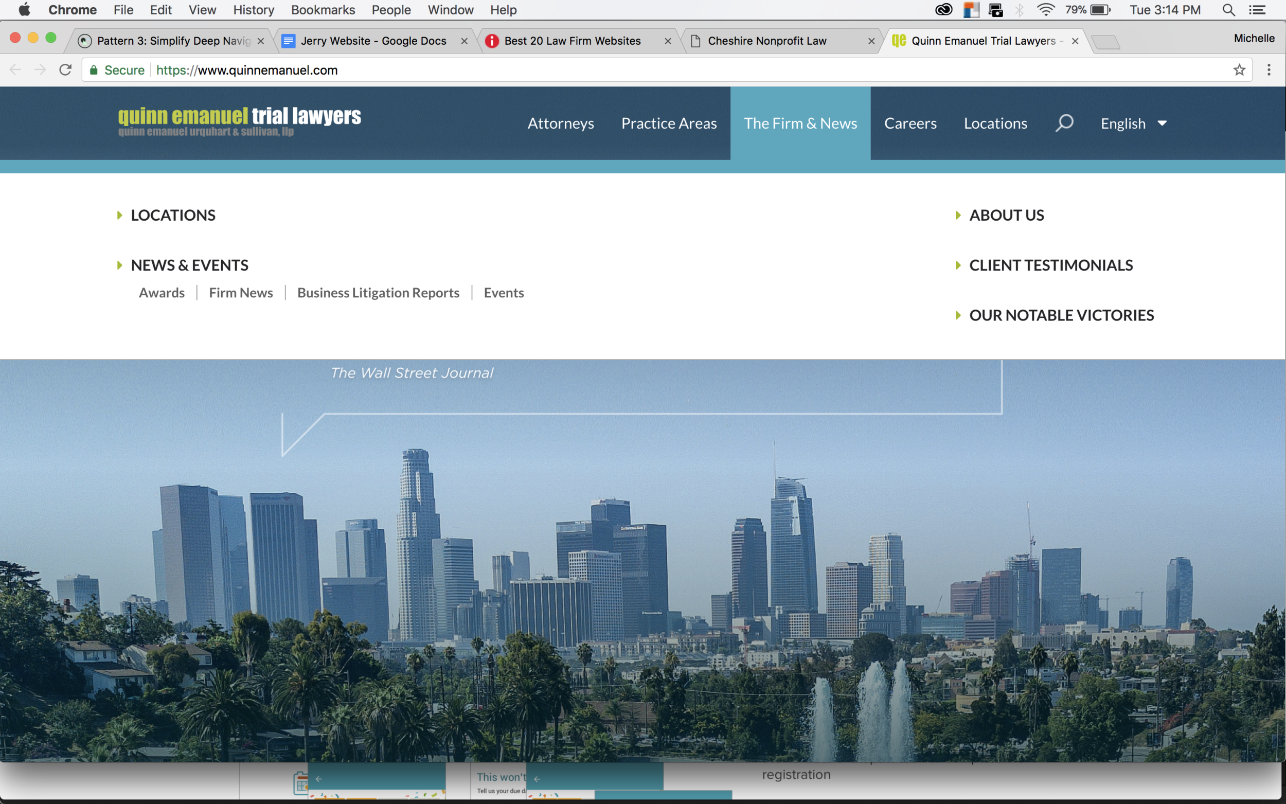
Quinn Emanuel Trial Lawyers
has a clean easy to use site. There is little clutter and limited calls to action. There are 5 straight to the point options in the navigation bar. The locations are easy to see and create visual interest.
The middle image shows two tasteful ways to get the customer to contact. The contact box is clean and straight to the point. The call to action in the top right is easy to read and carefully placed to draw the correct amount of attention. The below image shows wonderful imagery to let the customer preview what that page might be about. This is a great strategy for clarity.
Ideation
Ideation
Site trees, Site maps, Mock-ups
site trees
The two below images demonstrate the site architecture. The one on the left is the current tree. The right image is the new proposed tree. It eliminates repetition for customer clarity. It also introduces testimonials to build trust.
Take Aways:
While the site tree does not change drastically, the subtle changes improve use. I was able to test this using Optimal Workshop TreeJack.
sitemap
The following images represent two proposed site trees. The top shows what it would look like without a second level of navigation.
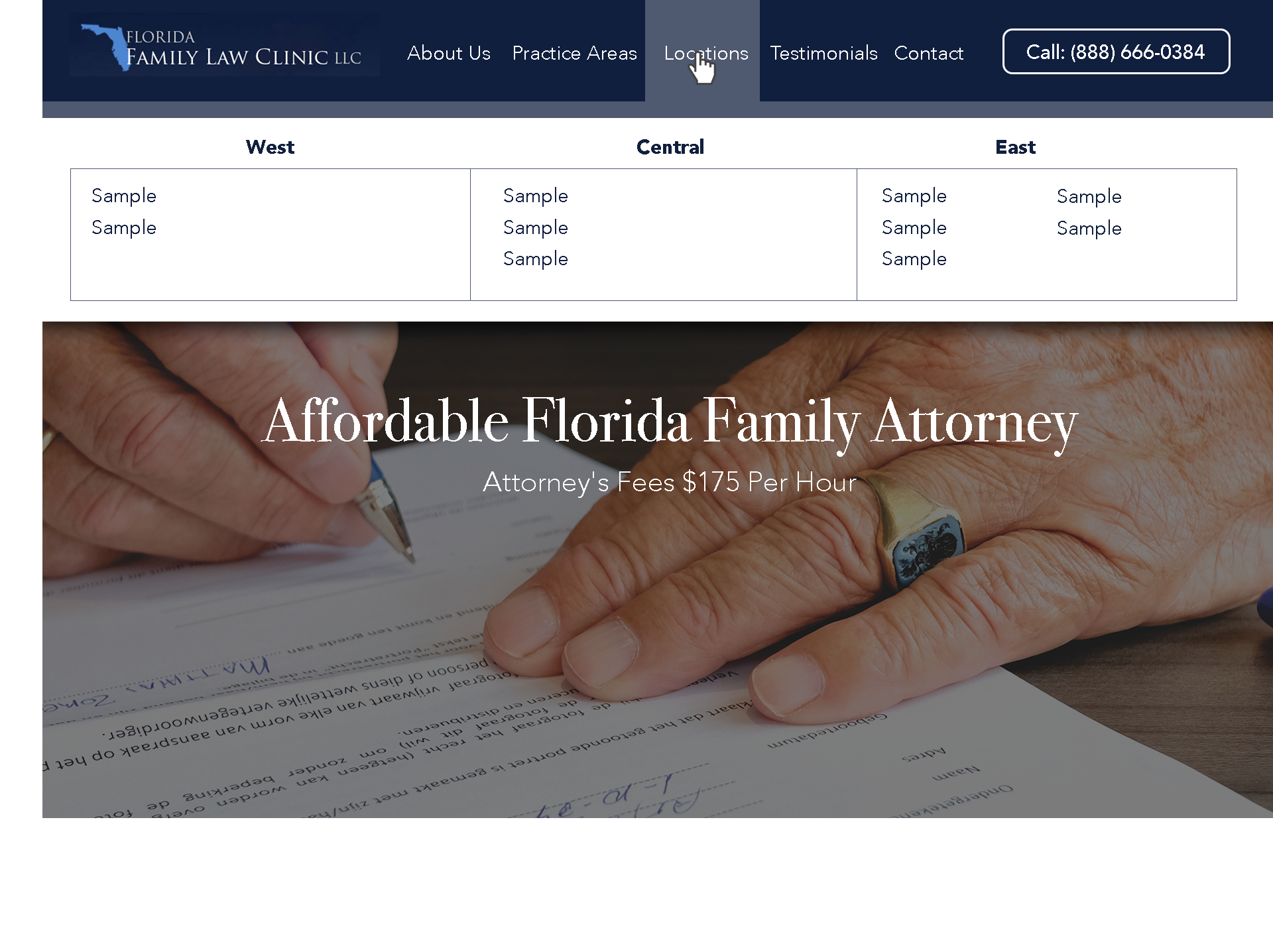
The second images shows what a second level of navigation would be. I have suggested that because of how many practice areas there are. It would be good to categorize them. Since the law clinic is expanding, I also suggest categorizing the locations by East, Central, and West.
It is important to keep in mind why the customer is on this site, build trust, then lead to action which would be making a call or scheduling an appointment.
It is important not to overwhelm the customer with too many options.
Mockup | single website
Homepage
I redesigned the homepage to show a sample of what I researched. The homepage below shows one call to action when you first open the page. This allows the user to think about what actions they wish to take to find out what they came onto the site to find. I implemented the navigation shown in the site architecture stage. The goal of the customer coming onto this site is to see if there is a practice in their area. They hover over locations and a drop down appears. They can now easily see their location because of categorization.
The main image shows that this company is professional. They are in fact attorneys and this builds trust. The unique quality of this business is that it is affordable thus the title of the page says so. The subtitle shows more detail into the pricing of the company.
Navigation
I implemented the navigation shown in the site architecture stage. The goal of the customer coming onto this site is to see if there is a practice in their area. They hover over locations and a drop down appears. They can now easily see their location because of categorization.
Location
The image to the right shows what information is needed for a landing page for each unique location.
I wrote up a sample paragraph showing that the customer wants to read about the unique qualities of their location.
I start off the page keeping a consistent photo but making it shorter to allow more room for immediate information. Following that is a map of where the practice is located similar to the current site. The next information I provide is the address. Then following that is a call to action which is to call that unique location for a free consultation. Communication is a key aspect of a successful website. The next piece I provide is if they had a more specific question they could reach out via the contact form.
I also kept the locations tab highlighted so the customer knows they are in the correct place.
mockup | unique urls
This is a sample of what a separate URL might look like if you chose that route. I would start with an “About” section to introduce the company. Then follow with location details and contact.
Summary
Summary
Review of the project

UI elements
I worked with several people and asked them to navigate the current site. The findings in the evaluation section of this document touch on many things I discovered through that exercise.
Main findings:
1. It was hard to decide what they should do first
2. They felt overwhelmed by the clutter
3. There were too many options to chose from under practice areas
4. “Why are there two divorce options? Are they different”
Refinement lasted about a week which is where I created designs, tested them with people, then changed and tweaked based on feedback. It was critical to design something clean, readable, and straight to the point. These were my goals throughout the project.
recommendations
I was hired to advice the company and this is what I sent them:
It seems as though the site needs revitalization. With necessary changes I believe that you will increase customer response by 10%. There is back-end SEO work to get the main pages of each location to show up in the specific areas. Once the location pages get cleaned up you should draw much more traffic to the company. The designs I created are suggestions based on user experience research. The main point of this PDF is to show you your two options for solving the problem. My research leans towards creating a more powerful successful page and driving traffic to it. I recommend creating unique facebook pages per location that then drive traffic to the main site. This gives an extra layer of marketing. Facebook is great at algorithms and location based suggestions.
Project Take-Aways
This was a quick turn-around project that required me to work swiftly to advice the company. It was great learning SEO practices and taught me about the options franchises have.